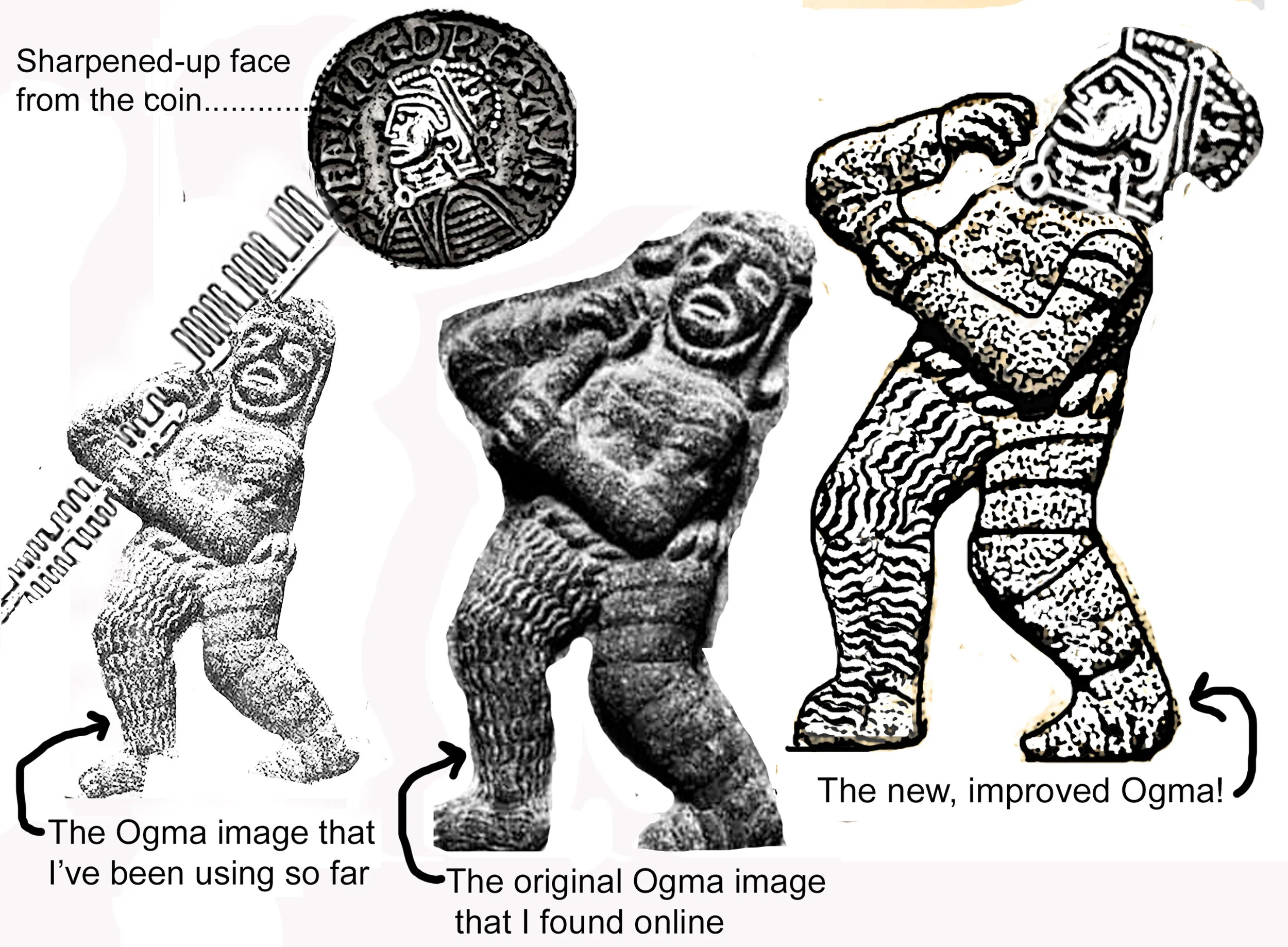
As I kept rearranging my gods, I decided that Ogma wasn’t working.
I don’t know what inspired Lawrie’s Ogma, but I couldn’t find anything that looked like his well-muscled warrior - only the fuzzy character (center, above) or romanticized cartoons (right, above). But as I scrolled along, I came across images of ancient Celtic coins:
OK, so if I borrowed from these images, at least I would be in the correct visual family, right? Wrong. In the case of ancient coins, ‘Celtic” doesn’t mean made in Ireland - it means found in Ireland. These are coins from other parts of the world that got dropped in Ireland. From the website https://coinweek.com/ancient-coins/the-first-irish-coins/ :
It may therefore seem surprising that none of the vast and complex coinage that numismatists describe as “Celtic” was struck in Ireland. “Celtic” coins come mainly from France, Britain, Spain and central Europe. Ancient and medieval Irish were talented metal workers–as we see from treasures like the Broighter gold collar (1st century BCE) and the Ardagh Chalice (8th century CE)–but they lived in a coinless society. Roman and other ancient coins have been found in Ireland, but they were kept as bullion, deposited as ritual offerings at sacred sites or worn as ornaments, not used as currency.
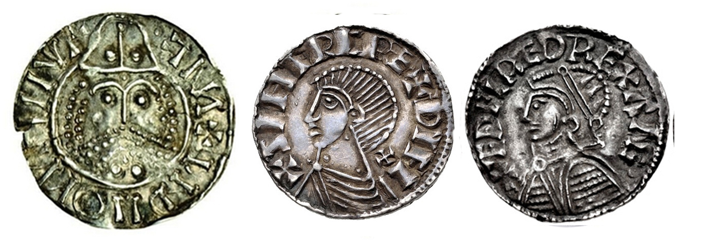
If I wanted actual Celtic images, I had to look for Hiberno-Norse coin images:
After much Photoshop, an improved Ogma is now ready to join the other gods:
Last week, I showed some inverted images. I kept playing with that until I had a whole pantheon of inverted gods:
I think part of the problem with this tablet was the confusion of colors. There’s SO much going on here that something had to be simplified. So I did this:
By keeping all the surrounding gods in basic earth tones, it’s a little easier to read. But still not looking good. OK, let’s take each inverted god, copy him separately to a new jpeg, and move them all around to get a better composition:
Simplify it further by replacing the dark bluish background with more earth tones:
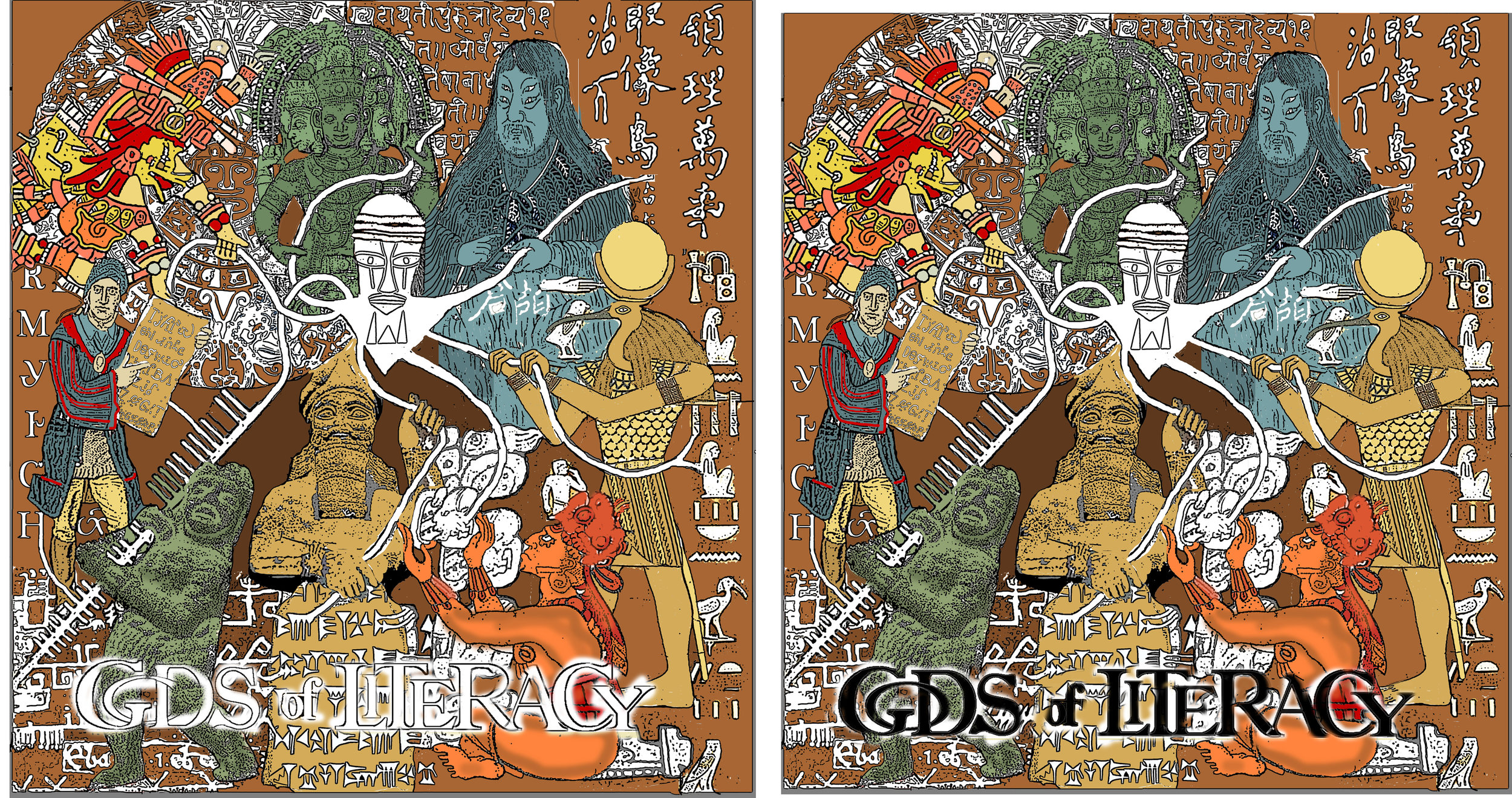
In this arrangement, the light lines define each god…so they can’t also be used for the letter forms…which means, yes, Diane, you need to change all those letters from white back to black. Which is how, finally, we get to this:
(deep breath) and now it sings. The gods appear as ghostly figures, the imagined deities who brought literacy. Anansi as a black, eye-riveting center, reaching out to the literacy of the world. Compare this to the first version:
So much better! And I’m trying something new: instead of printing the lines on cloth, and dye-painting, I’m sending this image to Spoonflower. This company will print out my design, in full color, on high-grade cotton….and the print will be 34” by 34”. That should keep me busy sewing!
When last we saw the Gods of Literacy, they were grabbing onto the legs of Anansi, as he gave them his stories. These words were bring channeled right into the glyphs, cuneiforms, hieroglyphs and other letter forms of each culture. So…since Anansi and his arms were going to be white (to stand out against the multi-colored images of the gods, and to make the connection visually obvious) then all the letters had to be white too.
Which means I had to go back, and run all the letters through this process:
Why didn’t I do that first? Well, it takes a LOT of time to magically hollow out each letter, even in Photoshop, so I’ve found it’s better to wait and see which ones I really wind up using.
Time to try colors. About half of these are based on the original colors of the images I found online. The others are best guess/see what works. Looks good to me! ah…but we need the title. Which cannot be the usual white, with all the white legs and letters.
Definite NO on the white. Black lettering does work…..but would it be possible to fit it in the center? The dark letters would help draw in the eye (instead of dragging it down off the page).
(many attempts later) OK then. Title in the center. Now I just have to print it out on cotton and paint in the dyes…..all around each of those tiny little letters.
Just as I was starting the dye-paint, I hurt my back. Not able to lean over the studio table for awhile. But, I pinned the cloth to some foamcore, and settled myself in a firm chair with a heating pad. For 2 days, I used very small brushes and sat very still and now it’s all painted……but.
But it’s just wrong somehow. The contrast will be improved by stitching, but is it REALLY worth all that sewing to see if maybe that will make it sing??? I tried a few photoshop variations:
By inverting the colors, I get a batik-like effect:
OK. Let’s leave this print for now. DO NOT SEW. Just go back to Photoshop, and start back with the original design.