• GALLERY
  • BLOG
  • VIDEOS
  • ABOUT
  • CONTACT
  • RESUME

Diane Savona

  • GALLERY
  • BLOG
  • VIDEOS
  • ABOUT
  • CONTACT
  • RESUME

National Museum of Brazil...the Tablet

Before we get to the tablet, some great news: The Abbey Studio, at 84 Washington Street, in Marblehead, MA is going to have a show of my tablets. It will run from Feb 4 until March 1st. If you happen to be in the area, please come see. Their website is theabbeystudio.com

Now, onto the art…

A while back, I posted about the fire that destroyed the Museum  of Brazil. Now I’m working on the design for the tablet. First, I gathered images of the museum….

2 post 1.jpg

… and the ruins left by the fire.

2 post 2.jpg

I had already gathered images of the art.

2 post 3.jpg

This image of the burned out museum has both the front façade and the blackened interior. The cute little fellow on the top right is a funerary urn, which I thought might be great in this design.

2 post 4.jpg

These tall masked figures would act as mourners in the background, perhaps?

2 post 6.jpg

And the mummies! The mummies have to be in the tablet. So we have:

2 post 7.jpg

A funerary urn (with the face from an Egyptian sarcophagus) holding the museum, plus mourners. Add the fire.

2 post 8 b.jpg

I wanted to show the neglect that had led to this catastrophe, so I spent many hours collecting images of collapsing barns, decrepit houses, rusty plumbing, etc…

2 post 9b.jpg

Many more hours constructing a top-heavy foundation. Yeah, you know where this is headed, don’t you?

2 post 10.jpg

Step away from the composition, Diane. This is not going anywhere good.

——————————————————————————-

OK,  a few days later…

2 post 11.jpg

First, let’s get the museum out of the urn.

2 post 12.jpg

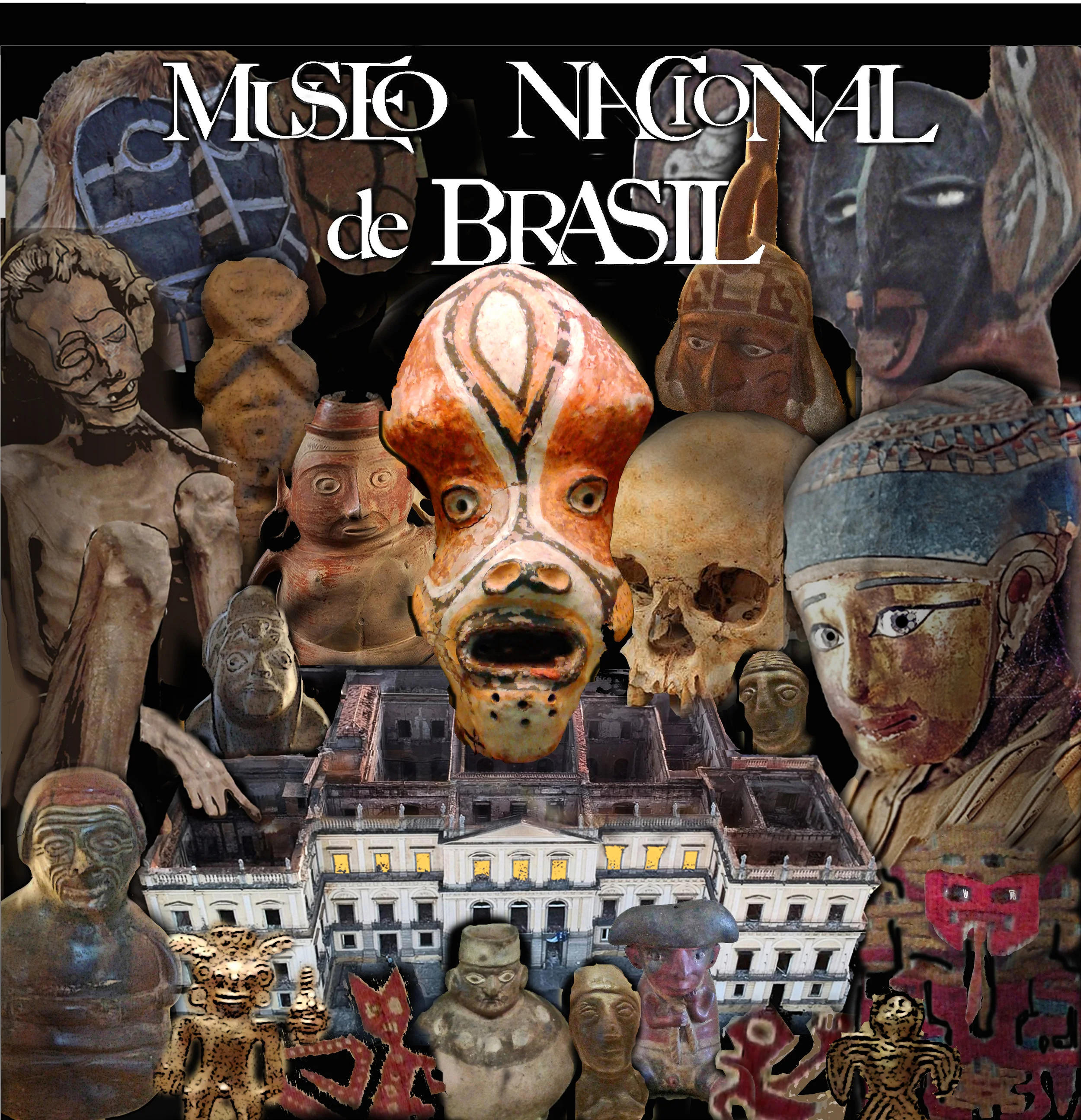
Then, let’s think about who really belongs here. Just because I really like the little funerary urn guy doesn’t mean he belongs front and center. The mask on the left is one of the oldest in the museum; the one in the center is one of the better-known; and the guy on the right makes a nice compositional reflection of the mask on the left.

2 post 13  ME.jpg

The three figures in the center work as a warm contrast to the darker figures on the edges.

2 post 14.jpg

Who else shall I cast? I love the sad sarcophagus face from that earlier image, but this one fits better. I ran her through Photoshop, using the transform perspective setting to turn her face towards the front, and moved her eyes.

2 post 15.jpg

Combining two different images of this mummy, I bent and twisted him all around until he was posed perfectly.

2 post 16.jpg

The angles are working here, pushing your eye to the center. Let’s try getting rid of the flames, and…what if I use the orangey mask as a symbol of the flames? Make it bigger and bring it forward to stand in as a blazing howl?

2 post 18.jpg


I know, I know: I’m crowding it in again. But the theme here is the horrible, HUGE destruction. They NEED to be here. I’m deliberately placing the eyes facing outward, looking at the viewer, making it impossible to look away from the art, the voices that were lost.

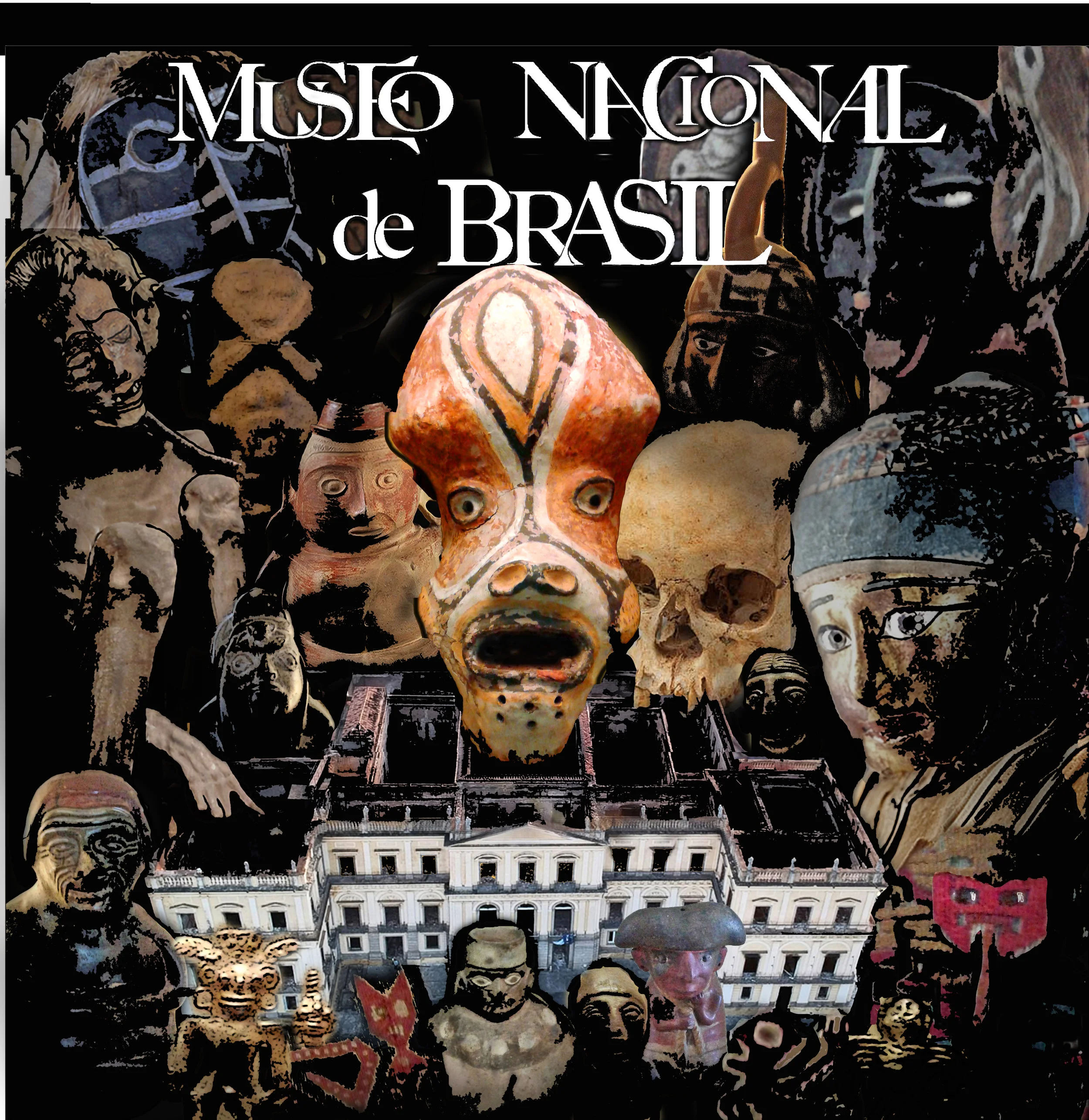
 Then I made a small mistake. I was using the paint bucket tool to add some black in one small spot. If I’m not careful, the paint can spread wildly all over (this is easily fixed with the UNDO button). But just before I pressed undo, I took a look….

2 post 19.jpg

sharp intake of breath here……

YES! perfect! I had planned to paint the surrounding characters dark, but I never would have gone THAT dark. The white letters and the white museum façade cap the top and bottom quite nicely. The characters are still identifiable, but just on the verge of being obliterated. It sings.  

 I’m going to try something different with this printing. Since there’s SO much black, instead of printing out black lines to color in, I’m going to try printing just a faint copy of the whole image:

2 post 20.jpg

Let’s see how this goes..

DSCN0301 blog.jpg

The black (which I painted over the other colors) didn’t take as well as I’d have liked. Back to the dye studio!

later: Extra black dye over the printed image helped a lot. I decided to sew this one on a black wool backing, for added depth of color. By adding sections of white cotton between the print and the backing, (see white sections below) I can punch up the light parts of the print.

IMG_0106.JPG

And here we are, all ready to sew:

IMG_0107.JPG

Most of the not-quite-black border will be ripped off. Time to sew!

 contact me at dianesavona@aol.com

Monday 01.07.19
Posted by Diane Savona
Newer / Older

Sign up for news from Diane!

Thank you!